These guidelines are to establish a fast, efficient, and best-practice informed design that renders well across all email clients. These rules can be broken but may cause cross-browser, cross-email client rendering issues. Following best practices insures consistent results across all platforms.
Source files are required when submitting email designs to Active3D. This allows us to make any adjustments to the design that may be necessary to ensure the design works across all email clients.
Any common design software source file type will work, but Illustrator or Photoshop is preferred. Please leave all artwork layered if possible.
LAYOUT GUIDELINES
1
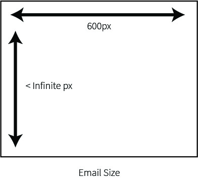
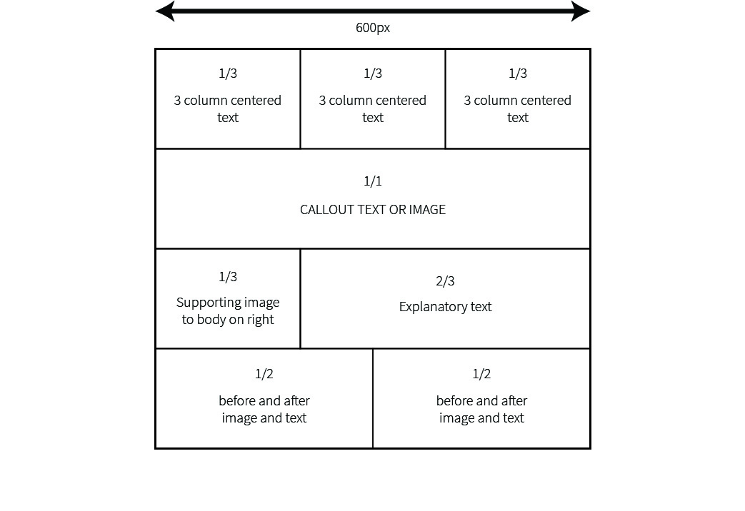
When designing the email, width should be hard set to 600 pixels wide. This will insure all mobile and desktop email renderers will render at the correct size and the email will not be cut off on mobile screens.
2
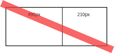
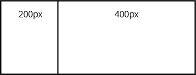
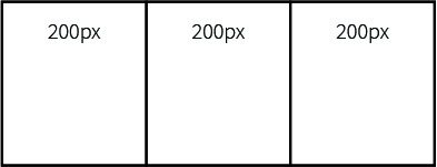
When laying out items side by side in the email, keep the divisions between sections consistent (1/2 by 1/2, 1/3 by 2/3,
1/3 by 1/3 by 1/3, etc). Pixel specific columns (for example, one column at 210 pixels and the next at 490) break and
layout differently across email platforms.
3
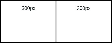
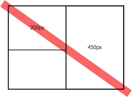
When laying out a multi-column design, keep row heights consistent. Varying row heights break and layout differently across email platforms. This is especially apparent in bordered sections. See example below:
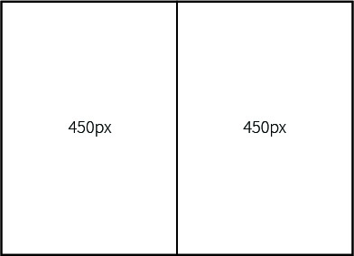
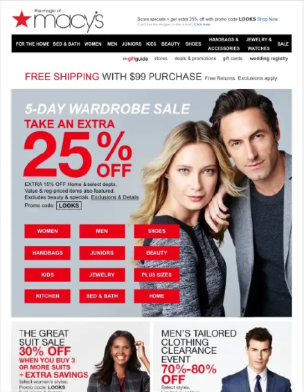
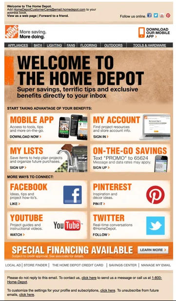
For example of rows and columns, see the design below. Column widths are kept consistent, and no column is outside the
bounds of its given row.
4
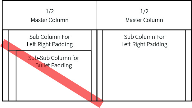
If it is necessary to divide up space further for margins or padding, columns and rows should not nest more than 2 layers deep. Please see example below
5
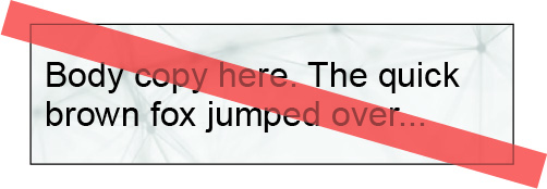
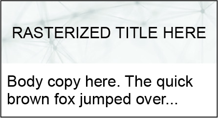
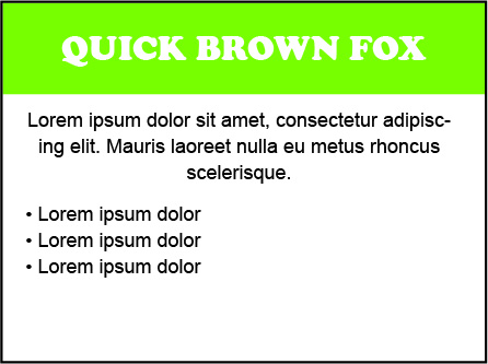
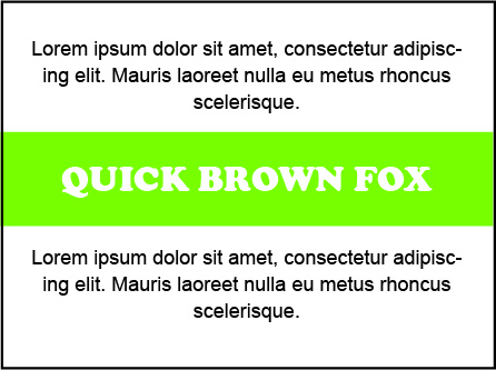
Images and live html text must be kept separate. Background images are not supported in Outlook for Desktop. Background images can still be used behind rasterized banner or header text. See example below.
6
Avoid using textured or complex backgrounds that span the entire email. Though the entire email can be sliced into images, no text will be selectable and some email clients will render borders between the sliced images.
FONT GUIDELINES
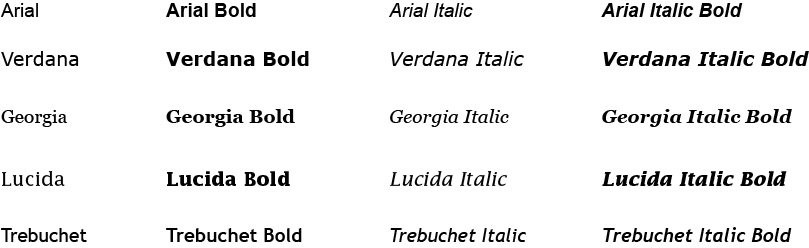
1
When designing, always use web safe fonts (see list below). These fonts are guaranteed to work on all web, desktop, and mobile browsers. Outlook for desktop does not support Google, Adobe, or external fonts.
2
Do not set custom character width, height, tracking, baseline shift, or skew on text during design. These settings cannot be replicated in html markup. Custom font weights (300, 400, 700, etc) are also not supported.
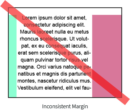
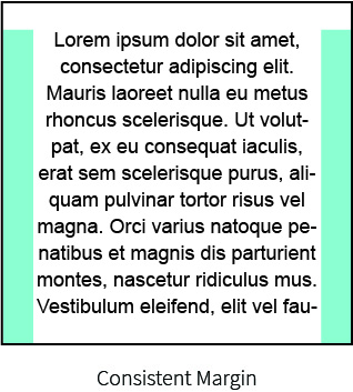
3
Margins on centered text should remain left-right consistent. This may cause the text to shift across email clients.
4
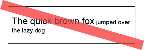
Text should remain a consistent size over the same line. Some email renderers will not respect different font sizes in the same line. Rendering the text as an image solves this problem, but removes the ability to select the text in the email.
6
Google, Adobe, or custom fonts can still be used in rasterized banner or header text. The email client will not recognize rasterized images as live text.
BULLETS GUIDELINES
1
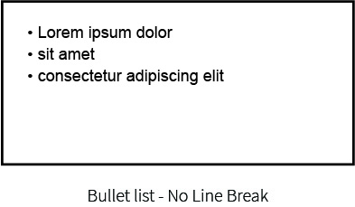
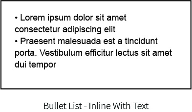
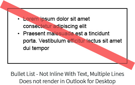
Bullets in emails can be used in 2 ways: • Inline with text - Multiline text cannot indent against the bullet. • Separated lists - Single line text can indent against bullet.
Lists indented to be in inline with bullet (3rd example below) may need to be converted to an image to render correctly.
DEPLOYMENT GUIDELINES
1
When links are provided, they should always be fully secure (https links, not http). Security settings on some user’s account may not let them access insecure links.
2
When planning on deploying the email campaign through Salesforce or similar tools, a text-only version of the email
should also be prepared. In order to guarantee compatibility with the online platform, this text only version should
be prepared on a Windows machine. Apple computers use non-standard encoding for characters that cause
character replacement issues when uploading to online tools.
EXAMPLES
Basic Examples
Click the examples to enlarge.
Advanced Examples
Click the examples to enlarge.
Examples of What Can Cause Issues in Email Clients
Click the examples to enlarge.
Design is complicated with no clear focus and breaks multiple layout guidelines
Design is overly simple and it is not clear what is expected of the recipient
Multiple columns inside of columns will break in certain email clients.
Full page texture background will generate borders on certain email backgrounds.


